ActRight for WordPress
Embed petitions, collect signatures, and create campaigns directly on your WordPress site. Visitors can sign without leaving your page.
Requirements
6.4 or higher
8.1 or higher
GPLv2 or later
Installation
Upload the plugin
Download the actright-1.26.0.zip file and upload it via Plugins → Add New → Upload Plugin in your WordPress admin. The download is named after its release. Alternatively, extract the actright folder to /wp-content/plugins/.
Activate
Go to Plugins in your WordPress admin and click Activate on ActRight for WordPress.
Configure your API key
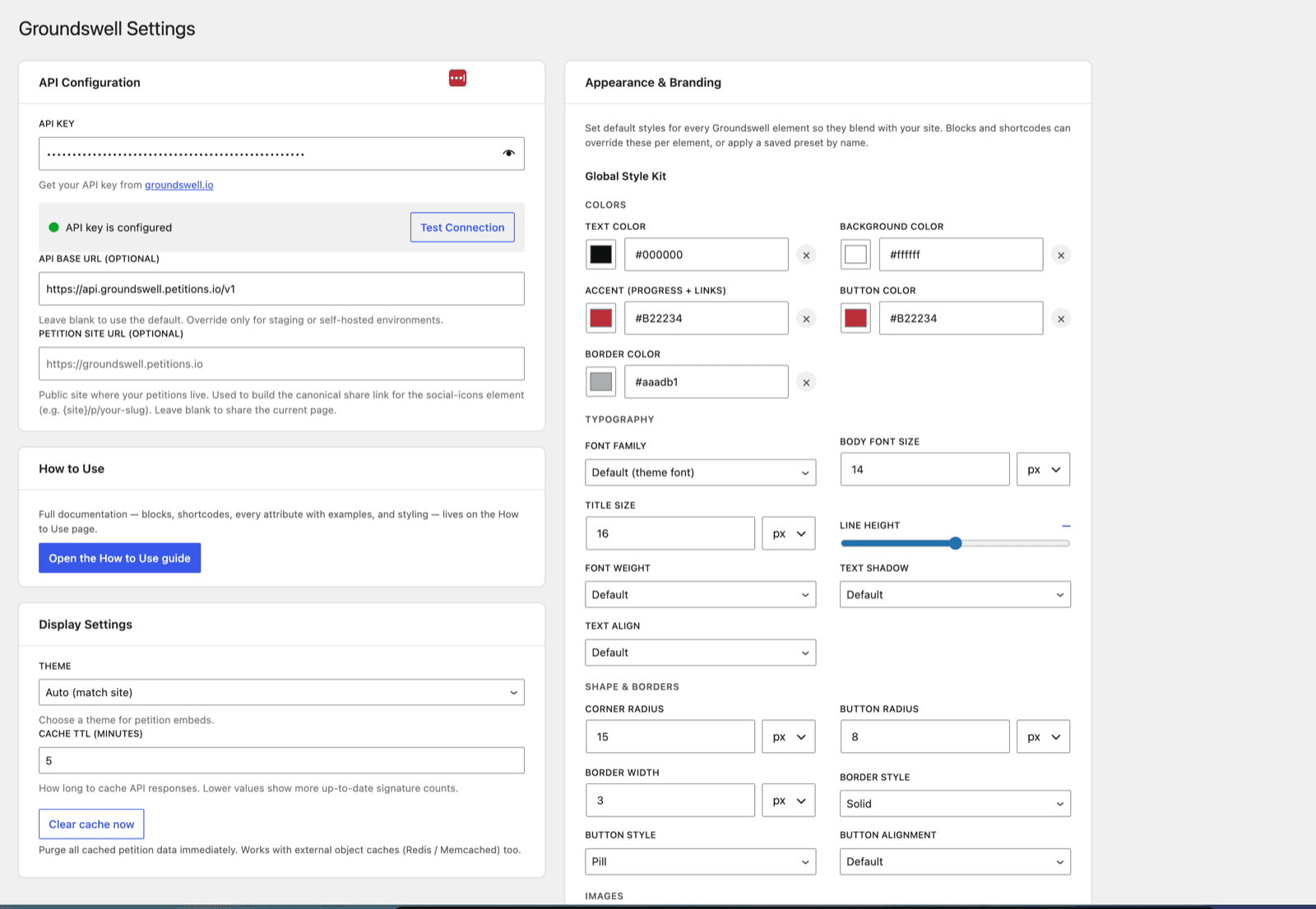
Navigate to Settings → ActRight and enter your API key, then use Test Connection to confirm it works. You can generate a key from your ActRight dashboard. The key should start with ar_live_.
Add petitions to your pages
Use the [actright] shortcode or the Gutenberg blocks to embed petitions anywhere on your site, or create a dedicated Petition Page. A full in-plugin guide is available at Settings → ActRight → How to Use.
Embed your first petition
The fastest way to get a petition onto your site is the [actright] shortcode. Paste this into any post, page, or widget:
[actright slug="save-springfield-park"]That's it — the petition renders as a full card with a live signature count, and visitors can sign without leaving your site. Every layout and styling option is covered in the shortcode reference below.
Features
Shortcodes
One [actright] shortcode with a type attribute covers every layout — for the classic editor, widgets, and page builders like Elementor.
Sign on Site
Visitors sign petitions without being redirected away from your site. The signing form is rendered inline or in a modal.
Real-time Counts
Signature counts and progress bars are never cached, so they show new signatures immediately. Recent-signer lists use a 60-second cache.
Appearance & Branding
A site-wide Style Kit, reusable named presets you can edit anytime, light/dark/auto themes, per-element color and typography controls, and a Custom CSS box let petitions match your design.
Sharing & Donations
An optional post-signature flow can fire confetti, show a share popup (Facebook, X, WhatsApp, LinkedIn, Copy Link), and embed the petition's Donorbox campaign — no Donorbox plugin required.
Gutenberg Blocks
Four blocks for the modern editor: embed a petition, show a list of petitions, let visitors start a new petition, or build a custom layout with the Petition Container.
Shortcode Reference
There is one main shortcode — [actright] — and the type attribute picks the layout. Use it in the classic editor, widgets, or any page builder.
Layout Types
[actright type="large-card" slug="save-springfield-park"][actright type="form-card" slug="save-springfield-park" theme="dark"][actright type="list" limit="6" sort="trending"]| type | Renders |
|---|---|
large-card | Full petition card (default) |
small-card | Compact card, image beside the text |
form | Just the signing form, no card |
form-card | Card with the signing form inline |
list | A list of petitions (uses limit / sort / category) |
signatures | Recent signers as a vertical list (standalone) |
signatures-carousel | Recent signers as an auto-scrolling ticker |
targets | The decision makers for a petition (standalone) |
Common Attributes
Every attribute is optional except a petition reference (slug or id), which is required for every type except list.
| Attribute | Values | Description |
|---|---|---|
slug / id | slug or UUID | Which petition (required except for list) |
description | full · expandable · trimmed | How much description to show (default expandable) |
show-signatures / show-progress | true · false | Show the signature count / progress bar (default true). Works on the cards and on lists. |
recent-signatures | 0–20 | Recent signers to list (0 hides) |
recent-layout | list · carousel | In-card recent signers as a list (default) or a carousel ticker |
target / target-avatar | 0–10 · true/false | Decision makers to list, and whether to show avatars |
language | en, es, fr, de, pt, it, zh | Show a translated petition |
theme | auto · light · dark | Color scheme |
text-color, background-color, button-color, accent-color | any CSS color | Customize colors (button text auto-contrasts) |
preset | a saved preset name | Apply an Appearance & Branding preset |
limit, sort, category, layout | 1–20; recent/popular/trending; UUID; list · grid | For type="list" only. layout="grid" arranges the petitions in columns instead of stacking them. |
Advanced Styling Attributes
Every attribute below is optional and works on the [actright] shortcode, the [actright-container], and each [actright-el] element. Unset values fall through to the applied preset, then the Style Kit, then the plugin defaults.
| Attribute | Values | Affects |
|---|---|---|
preset | a saved preset name | Apply an Appearance & Branding preset (other attributes override it) |
class | CSS class name(s) | Add your own class to the rendered element |
font-family, font-size, heading-size, font-weight, line-height, text-shadow | CSS values; font-weight = 100–900 | Typography |
text-align, self-align, margin | left·center·right·justify; start·center·end·stretch; CSS margin (e.g. 0 auto) | An element's content alignment, the element box's own alignment, and outer spacing |
radius, button-radius, button-style, button-align, border-width, border-style, border-color | CSS values; button-style = solid·outline·pill; button-align = left·center·right·full; border-style = solid·dashed·dotted·double·none | Shape & borders |
image-width, image-height, avatar-size | CSS lengths | Petition image size; decision-maker / signer avatar size |
padding, gap, shadow, opacity, carousel-speed | CSS values; carousel-speed e.g. 40s | Spacing, elevation, overlay opacity, and ticker speed |
A fully-loaded example combining several options:
[actright type="form-card" slug="save-springfield-park" description="full" recent-signatures="5" recent-layout="carousel" target="2" target-avatar="true" preset="my-brand" accent-color="#16a34a"]Donation Shortcodes
Place a Donorbox donation form, or a button that opens one in a modal, on any page. With no slug they use the current Petition Page's campaign.
[actright-donate slug="your-campaign"][actright-donate-button label="Donate" slug="your-campaign"][actright-donate-button title="Support us" subtitle="Every dollar helps"]Both donation shortcodes also accept a class attribute to target the embed or button from your own CSS — the same passthrough available on [actright], [actright-container], and [actright-el].
Container Layout
Build your own petition layout from only the elements you want, in any order. In the block editor, add the ActRight Petition Container block, pick a petition, then drag in ActRight Element blocks. Or use the shortcode form — the petition loads once and is shared by every element inside:
[actright-container slug="save-springfield-park" max-width="600px" gap="1.5rem"]
  [actright-el type="count" label="people have signed"]
  [actright-el type="progress"]
  [actright-el type="form"]
  [actright-el type="social"]
[/actright-container]Element type values: title, description, image, creator, count, progress, form, sign-button, status, recent-signatures (recent-layout list or carousel), targets (target-layout list or card), donation, social, and spacer. Both the container and each element accept the full styling attribute set of [actright] — every color, font, border, radius, shadow and text-shadow option, plus preset (a saved Appearance & Branding preset) and class. On an element they apply to that element only; on the container they set inherited defaults (a container preset applies to every element, and an element's own values override it). The container also takes layout (column · row · grid), gap, max-width, align, and columns.
| type | Renders | Element options |
|---|---|---|
title | The petition title | tag (h1·h2·h3·h4, default h3) |
description | The rich-text description | description (full·expandable·trimmed) |
image | The featured image | image-width, image-height |
creator | “Started by” organization or creator | avatar (true·false, default true) |
count | The signature count | label (text or a template, e.g. “Join {{count}} supporters”), show-label (true·false) |
progress | Progress bar (only with a goal) | label (template, e.g. {{percent}}% there), show-label (true·false) |
form / sign-button / status | Inline form / a button that opens the sign modal / a victory · closed badge | sign-button takes label |
recent-signatures | Recent signers | count (1–20), recent-layout (list·carousel), avatar (true·false), avatar-size |
targets | Decision makers | count (1–10), target-layout (list·card), target-avatar (true·false), avatar-size |
donation | A Donorbox form or button | variant (embed·button), label, title, subtitle |
social | A share-icons row (Facebook, X, LinkedIn, WhatsApp, Copy) | networks (comma list; default all), label, share-url |
spacer | Blank space or a divider line | height (e.g. 2rem), divider (true·false) |
Labels on count / progress accept the placeholders {{count}}, {{goal}}, and {{percent}} so you can write your own text — e.g. label="{{count}} people have signed" or label="{{percent}}% of the way there".
The social element shares the petition's canonical link — set its base under Settings → ActRight → Petition site URL.
Gutenberg Blocks
In the block editor, click + and search ActRight. Four blocks are available. Every option lives in the editor sidebar.
ActRight Petition
Embed a single petition with full signing capability. Pick a petition from your organization (or enter a slug), choose a layout, and configure display options.
View block attributes
| Attribute | Type | Default | Description |
|---|---|---|---|
slug | string | "" | Petition slug (or use petitionId) |
petitionId | string | "" | Petition UUID |
cardType | string | "large-card" | Layout: large-card, small-card, form, form-card, signatures, signatures-carousel, targets |
descriptionMode | string | "expandable" | full, expandable, or trimmed |
showSignatures | boolean | true | Show signature count |
showProgress | boolean | true | Show progress bar |
showShareButtons | boolean | true | Show social share buttons |
recentSignaturesCount | number | 0 | Recent signers to list (0–20; 0 hides) |
recentLayout | string | "list" | In-card recent signers as a list or carousel |
recentAvatar | boolean | false | Show each recent signer's avatar |
targetCount / targetAvatar | number / boolean | 0 / false | Decision makers to show (0–10), and their avatars |
locale | string | "" | Display language (en, es, fr, de, pt, it, zh) |
theme | string | "auto" | light, dark, or auto |
A Colors panel (text, background, button, accent) and an Advanced Appearance panel (presets, fonts, radius, spacing, shadow, and a custom CSS class) are also available in the sidebar.
ActRight Petition List
Display a list of petitions, filtered by category and sorted by recency, popularity, or trending status.
View block attributes
| Attribute | Type | Default | Description |
|---|---|---|---|
sortOrder | string | "newest" | newest, most_signatures, or trending |
categoryFilter | string | "" | Filter by category |
layout | string | "grid" | grid or list |
perPage | number | 6 | Number of petitions to show |
showSignatures / showProgress | boolean | true | Show counts / progress bars |
descriptionMode | string | "expandable" | full, expandable, or trimmed |
theme | string | "auto" | light, dark, or auto |
Like the Petition block, a Colors panel and an Advanced Appearance panel (presets, fonts, radius, spacing, shadow, and a custom CSS class) are available in the sidebar.
ActRight Petition Form
Let visitors create new petitions directly from your WordPress site. The block renders a full petition creation form with configurable defaults.
View block attributes
| Attribute | Type | Default | Description |
|---|---|---|---|
categoryId | string | "" | Pre-select a category |
redirectAfterCreate | boolean | true | Redirect to petition after creation |
showTargetFields | boolean | true | Show decision maker fields |
showImageUpload | boolean | false | Allow an image upload (max maxImageSizeMB, default 5) |
enableRichDescription | boolean | false | Rich-text description editor |
theme | string | "auto" | light, dark, or auto |
ActRight Petition Container
Build your own petition layout from only the elements you want, in any order. Pick a petition, then drag in ActRight Element blocks (title, image, count, progress, form, sign button, decision makers, recent signatures, social, donation, spacer, and more). The petition loads once and is shared by every element inside. Each element — and the container itself — exposes the same Colors and Advanced Appearance panels (presets, fonts, radius, spacing, shadow, and a custom CSS class) as the ActRight Petition block. The full attribute reference is in the in-plugin How to Use guide and under Container Layout below.
Elementor widgets
If your site uses Elementor, open the widget panel and look for the ActRight group. Every widget is an adapter over the same renderer the blocks and shortcodes use, so a petition looks identical however you place it.
Whole-petition widgets
Three widgets place a complete petition. Each has a Petition section where you pick the petition from a dropdown of your most recent 100, or type a slug or ID for any other.
| Widget | Renders |
|---|---|
| Petition | One petition in one of four layouts: large card, small card, card with the signing form built in, or the form on its own. Also controls the description length, the signature count, the progress bar, recent signers and decision makers. |
| Petition List | Several petitions at once, with controls for how many, the order, the category, and an Arrangement setting (stacked or grid). The signature count and progress bar can each be switched off. |
| Start a Petition | The petition creation form. Optionally preselects a category, asks for the decision maker, and either redirects to the new petition or shows a thank-you on the same page. |
One-piece widgets
Fourteen more widgets each place a single piece of a petition, so you can build your own layout with Elementor containers instead of ours:
- Title
- Description
- Image
- Started by
- Signature count
- Progress bar
- Signing form
- Sign button
- Status badge
- Recent signatures
- Decision makers
- Donation
- Share buttons
- Spacer
Styling
Every widget has an ActRight Appearance group on Elementor’s Style tab, with the same colours, fonts, borders, spacing and saved presets the blocks and shortcodes use. Elementor’s own Advanced tab still applies to the widget wrapper as usual.
Several ActRight widgets pointing at the same petition on one page cost only one API request, so a layout built from many small widgets is no slower than one big widget.
Settings
Configure the plugin at Settings → ActRight in your WordPress admin.
| Setting | Default | Description |
|---|---|---|
| API Key | — | Your ActRight API key (starts with ar_live_). Stored encrypted in the database. |
| API Base URL | — | Optional override of the API endpoint for staging or self-hosted setups. Leave blank to use production. |
| Petition site URL | — | Optional. The public site where your petitions live, used to build the canonical share link for the share-icons element. Leave blank to share the current page. |
| Theme | auto | Default theme for all embedded petitions. Options: light, dark, auto (matches your site). |
| Cache TTL | 5 min | How long API responses are cached using WordPress transients (1–60 minutes). Signature counts are never cached. A “Clear cache now” button purges everything on demand (works with Redis / Memcached too). |
Two more panels live on the settings page: Appearance & Branding (a site-wide Style Kit, named presets, and a Custom CSS box) and Post-Signature Popups (confetti, a share popup, and a Donorbox donation popup). The How to Use guide opens from a link on the same page (full reference for every block option, shortcode, attribute, and the container elements).
Appearance & Branding
Set your brand once under Settings → ActRight → Appearance & Branding. The site-wide Style Kit sets defaults for the same tokens listed in Advanced Styling Attributes above (colors, typography, shape & borders, image sizing, spacing, shadow, and more). Blocks and shortcodes can override any token per element, or apply a saved preset by name. The cascade is per-element override → preset → Style Kit → plugin default.
Presets
Configure the Style Kit, name it, and save it as a preset. Apply it on a block (Advanced Appearance → Style preset) or a shortcode. Each preset can be edited after saving (Presets → Edit), so different presets carry genuinely different looks — and the block editor previews the selected preset live, exactly as it renders on your site.
[actright type="large-card" slug="save-springfield-park" preset="my-brand"]Custom CSS & classes
For anything the options don't cover, use the Custom CSS box (loaded after the plugin styles), or add your own class and target these stable class names:
.actright-petition-embed— single petition card.actright-petitions-list— petition list wrapper.actright-petition-card__sign-button— sign / donate button.actright-recent-signatures— recent signatures (list + carousel).actright-targets— decision-maker targets
Post-Signature Popups
When someone signs, the plugin can celebrate and keep them engaged. Configure these under Settings → ActRight → Post-Signature Popups.
- Confetti — a celebratory burst on a successful signature.
- Share popup — Facebook, X/Twitter, WhatsApp, LinkedIn, and Copy Link buttons, with a customizable title, subtitle, and share message.
- Donation popup — after the share step, embeds the petition's Donorbox campaign automatically — no Donorbox plugin required.
These fire after the petition card's built-in sign form. A composable [actright-el type="form"] (and the form inside [actright-container]) instead shows only its own inline thank-you, so you can place your own [actright-el type="social"] and [actright-el type="donation"] elements wherever you like.
Petition Pages
Prefer each petition to have its own page? Go to Petition Pages → Add New, pick a petition (and language), and publish. Each gets its own URL, rendered through your active theme's template, and all of them are listed at /petitions/. Use a block or shortcode instead when you want to place a petition inside a page you are designing.
Screenshots
Visual walkthrough of the ActRight WordPress plugin in action.
Plugin settings page
Ready to get started?
Download the plugin, add your API key, and start embedding petitions on your WordPress site in minutes.